

Connectivity: best lag and \(p\)-value landscapes (SynthATDelays)#
This short demo focuses on a minimal, interpretable workflow using
the SynthATDelays “random connectivity” generator.
We generate synthetic airport delay time series with
gen_synthatdelays_random_connectivity(),
pick two airports and find the optimal lag with Granger causality (GC), visualise the GC \(p\)-values across lags to see how
the optimum is selected, and finally compare the \(p\)-value landscapes of several measures (LC/RC/GC/MI/TE).
import delaynet as dn
from delaynet.connectivities.granger import gt_single_lag
from numpy.random import default_rng
from matplotlib import pyplot as plt

rng = default_rng(1612757)
1. Generate synthetic airport delays and pick two series#
We use the SynthATDelays “random connectivity” scenario to obtain realistic delay time series. Then we select two airports and estimate the optimal lag with GC.
# Generate transportation-like delay time series (airports × time)
results = dn.preparation.gen_synthatdelays_random_connectivity(
    sim_time=40,        # Simulation time in days
    num_airports=5,     # Number of airports
    num_aircraft=14,    # Number of aircraft
    buffer_time=0.8,    # Buffer time between operations in hours
    seed=16729410976    # Random seed for reproducibility
)

# Extract the average arrival delay matrix
time_series = results.avgArrivalDelay
print(f"Shape of arrival delays matrix: {time_series.shape}")

# Extract two time series
ts1 = time_series[:, 0]
ts2 = time_series[:, 1]
max_lag = 50

# Using this package
best_p_value, lag = dn.connectivity(ts1, ts2, "gc", lag_steps=max_lag)

print(f"Best lag: {lag}")
print(f"Best p-value: {best_p_value}")
Shape of arrival delays matrix: (960, 5)
Best lag: 4
Best p-value: 0.2573089607793928
2. Visualise GC \(p\)-values across lags#
A simple scan of lags shows how the optimal delay corresponds to the minimum \(p\)-value.
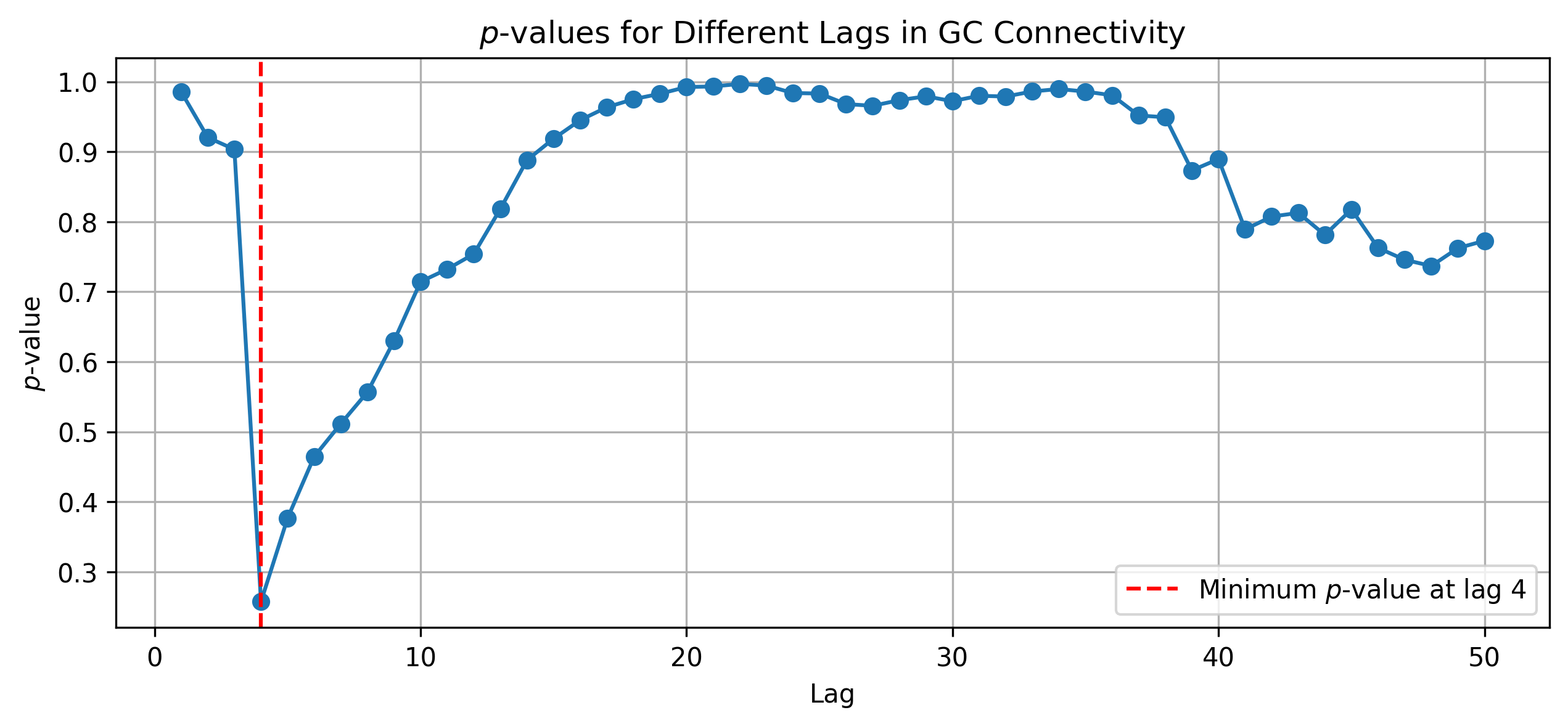
This plot shows the evolution of the \(p\)-values calculated for each lag, as obtained by the GC on two synthetic time series created with a delayed causal network. The minimum \(p\)-value is interpreted as the optimal delay, indicating the most significant causal connection. Note how \(p\)-values can increase for high lags; as their calculation requires more complex models, the corresponding degrees of freedom also increase, resulting in less statistically significant results. See Network Reconstruction for a discussion of best-lag selection and \(p\)-values.
3. Compare connectivity measures and their \(p\)-value landscapes#
We next compare several measures on the same pair (using a smaller max lag) and then plot their \(p\)-value curves across lags.
max_lag = 20
(
    dn.connectivity(ts1, ts2, "lc", lag_steps=max_lag),
    dn.connectivity(ts1, ts2, "rc", lag_steps=max_lag),
    dn.connectivity(ts1, ts2, "gc", lag_steps=max_lag),
    dn.connectivity(ts1, ts2, "mi", lag_steps=max_lag, approach="kernel", kernel="box",
                    bandwidth=0.01),
    dn.connectivity(ts1, ts2, "te", lag_steps=max_lag, approach="ordinal",
                    embedding_dim=3)
)
((np.float64(0.03214475262056492), 4),
 (np.float64(0.0668390784319473), 4),
 (np.float64(0.2573089607793928), 4),
 (np.float64(0.6), 15),
 (np.float64(0.05), 20))
We see the different approaches find different best \(p\)-values at differing lags. Let’s also visualise each method’s \(p\)-value landscape.
lags = range(1, 24, 1)
p_vals_per_method = {
    "LC": _pearson_pval,
    "RC": _rc_pval,
    "GC": gt_single_lag,
    "MI (Box Kernel)": mi_p_value,
    "TE (Ordinal D=3)": te_p_value,
}
p_vals_per_method = {
    key: get_p_values(ts1, ts2, val, lags)
    for key, val in p_vals_per_method.items()
}
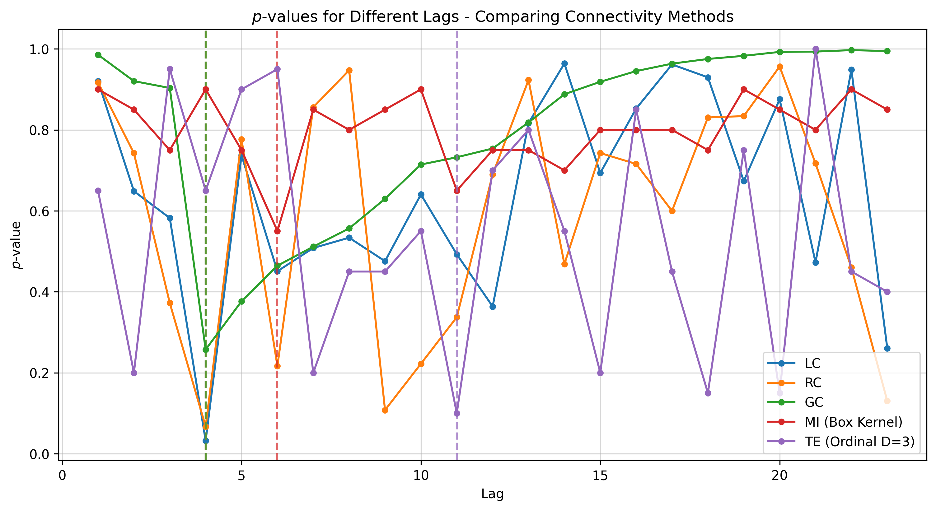
The \(p\)-value curves produced in our run are shown for reference.
These illustrate that different methods often achieve their minima at different lags, with varying significance levels.
MI here uses a kernel estimator with a box kernel and specific bandwidth; changing the estimator or its parameters may alter sensitivity. TE here uses an ordinal estimator with embedding_dim=3; as
with MI, the estimator choice and parameters matter and can change outcomes.
Interpretation notes#
There is no strict hierarchy among connectivity measures. While TE is more sophisticated than a simple correlation, it is not universally “better”; the right choice depends on the data, the task, the estimator, and the window length (see Connectivity and Network Reconstruction). Non‑linear approaches such as TE and MI typically require longer time series to detect relationships reliably, and may therefore be ill‑suited for short windows where data are scarce. When the underlying propagation is predominantly linear, non‑linear methods can be ill‑matched to the signal, whereas linear methods (LC/RC/GC) can perform strongly. Importantly, linear approaches do not ignore non‑linear relations; they capture the linear component or a linear approximation of them, so a negative result from a linear method does not prove the absence of non‑linear dependence—and vice versa. Finally, remember that \(p\)-values quantify statistical significance, not effect size; they vary with series length, noise level, estimator settings, and degrees of freedom (which typically grow with lag/order), so avoid comparing \(p\)-values across datasets or lengths without care.