Functional Delay Networks Series of Swiss public transport in August 2025#


In this demo we process pre-aggregated delay time series to extract a functional delay network using the delaynet package. The event-level extraction and aggregation (from SBB realised timetable data to 15‑minute station bins) was performed externally and is not shipped with this demo; we therefore start from monthly CSVs that already contain, for each station_id × time_bin, the summed arrival delay delay_sec_sum. If you wish to reproduce this on your own data, prepare an equivalent long-format table as described in Data preparation and then follow the same steps below.

Reminder: We focus on the subset of SBB-operated long‑distance services with long_distance_prefixes = ['IC', 'IR', 'EC', 'ICE', 'TGV'], drawing from the open historic dataset.

import delaynet as dn
import geopandas as gpd
import contextily as cx
import pandas as pd
import matplotlib.pyplot as plt
import matplotlib.patches as mpatches
from matplotlib.colors import ListedColormap
import numpy as np
import networkx as nx
# Load station metadata (long-distance stations) prepared externally
stops_long_distance_gdf = gpd.read_file("./stops_long_distance_gdf_07-2025.geojson")
stops_long_distance_gdf.explore(
    column="log_count",
    markersize=1,
    tiles="CartoDB.Positron",
    marker_kwds={"radius": 7},
)
Make this Notebook Trusted to load map: File -> Trust Notebook
  • Delay data has been preprocessed externally into 15-minute aggregates per station and time bin, stored as delay_sec_sum values. See the preparation overview in Data preparation for the expected input format and cleaning considerations.

  • Station metadata for long-distance services is provided via stops_long_distance_gdf_07-2025.geojson (GeoJSON). We focus on SBB-operated long-distance prefixes. For a refresher on assembling time series matrices for network work, see Network reconstruction and Connectivity overview.

First, we are interested in the 15 min binned data.

Hide code cell source

# Load the time series and verify
import hashlib
from pathlib import Path
import requests

url = "https://github.com/cbueth/delaynet/releases/download/v0.3.2/arrival-sum-2025-08-15mins-allstations.csv"
sha256_expected = "6c0358cb369964910b752b774d0ce9f2f887ce153f7599cbb23faef5a99264c4"

# Cache in a session-local tmp directory
cache_dir = Path("./.cache")
cache_dir.mkdir(parents=True, exist_ok=True)
csv_path = cache_dir / "arrival-sum-2025-08-15mins-allstations.csv"


def file_sha256(path: Path) -> str:
    h = hashlib.sha256()
    with path.open("rb") as f:
        for chunk in iter(lambda: f.read(8192), b""):
            h.update(chunk)
    return h.hexdigest()


if not csv_path.exists() or file_sha256(csv_path) != sha256_expected:
    r = requests.get(url, stream=True, timeout=120)
    r.raise_for_status()
    with csv_path.open("wb") as f:
        for chunk in r.iter_content(chunk_size=8192):
            if chunk:
                f.write(chunk)
    # Verify checksum after download
    assert file_sha256(
        csv_path) == sha256_expected, "SHA-256 mismatch for downloaded file."

arrival_delay_15mins_df = pd.read_csv(csv_path)
arrival_delay_15mins_df.head()
station_id time_bin delay_sec_sum
0 8500010 2025-08-01 08:00:00+00:00 -50
1 8500010 2025-08-01 08:30:00+00:00 -70
2 8500010 2025-08-01 08:45:00+00:00 -184
3 8500010 2025-08-01 09:00:00+00:00 644
4 8500010 2025-08-01 09:15:00+00:00 -143

This array includes for each station and time bin the sum of the delays in delay_sec_sum. The head of the table shows for 8500010 (Basel SBB) for most columns a negative value, which means most trains must be colloquially “on time”, but really arrive a bit before the scheduled time, which is the desired case. One of the shown bins is positive and points to delayed trains. We must emphasise that the observed sum is only a macroscopic measure and not per-train, as we cannot say if the delay comes by one really delayed train, or is a sum of many small late arrivals. For the analysis, this is not a problem.

The stations of interest are the stations in stops_long_distance_gdf["station_id"]. To make the analysis faster, we might only take a subset of them. As the most large stations are the first ones, we can take the first \(n=50\) train stations.

stops_long_distance_gdf[:6]
station_id count designationofficial abbreviation cantonabbreviation height log_count geometry
0 8503000 17906 Zürich HB ZUE ZH 407.70 9.792891 POINT (2683189.561 1248065.978)
1 8500010 9566 Basel SBB BS BS 276.75 9.165970 POINT (2611362.891 1266309.826)
2 8501120 9354 Lausanne LS VD 447.09 9.143559 POINT (2537874.991 1152042.412)
3 8500218 7950 Olten OL SO 396.00 8.980927 POINT (2635441.909 1244670.532)
4 8501008 7023 Genève GE GE 392.01 8.856946 POINT (2499968.949 1118468.129)
5 8507000 6496 Bern BN BE 540.20 8.778942 POINT (2600037.945 1199749.812)
n = 50
arrival_delay_15mins_df = arrival_delay_15mins_df[
    arrival_delay_15mins_df["station_id"].isin(
        stops_long_distance_gdf["station_id"][:n]
    )
]

The data is a table of station_id, time_bin, and delay_sec_sum. From this, we want to make a matrix of station_id and time_bin and the delay_sec_sum as the values. A matrix of shape ( n_stations, n_time_bins) where the stations are sorted by stops_long_distance_gdf["station_id"][:n] and the time bins are sorted by, well, time. As 0-values are just left out in the delay DataFrame, we need to fill them with zeros.

print(list(stops_long_distance_gdf["station_id"][:n]))
[8503000, 8500010, 8501120, 8500218, 8501008, 8507000, 8501026, 8503016, 8506000, 8501118, 8505000, 8504100, 8506302, 8501037, 8501030, 8501609, 8500023, 8502113, 8502204, 8503504, 8500309, 8503006, 8501605, 8504300, 8509411, 8501300, 8501506, 8501400, 8504200, 8504221, 8501200, 8501500, 8506206, 8506208, 8506210, 8506209, 8500026, 8501509, 8504023, 8504014, 8500305, 8500301, 8507483, 8507100, 8502001, 8502007, 8500207, 8509002, 8509000, 8506311]
# -> matrix format (n_stations, n_time_bins)
arrival_delay_15mins_matrix = arrival_delay_15mins_df.pivot_table(
    index="station_id", columns="time_bin", values="delay_sec_sum", fill_value=0
)
# Reorder according to stops_long_distance_gdf["station_id"][:n]
arrival_delay_15mins_matrix = arrival_delay_15mins_matrix.reindex(
    stops_long_distance_gdf["station_id"][:n]
)
arrival_delay_15mins_matrix.shape
(50, 2709)

Hide code cell source

# Plot a polished heatmap of the first n_bins time bins
n_bins = 270

# Precompute matrix and its signed log-transform
data = arrival_delay_15mins_matrix.to_numpy()[:, :n_bins]
signed_log = np.log1p(np.abs(data)) * np.sign(data)
abs_max = np.nanmax(np.abs(signed_log))

fig, ax = plt.subplots(figsize=(10, 4), dpi=300)
im = ax.imshow(
    signed_log,
    cmap="seismic",
    vmin=-abs_max,
    vmax=abs_max,
    aspect="auto",
    interpolation="nearest",
)
# Labels and ticks
ax.set_title(
    f"SBB long-distance: signed log(1 + |arrival delay|), first {n_bins} bins", pad=10
)
ax.set_xlabel("Time bin")
ax.set_ylabel("Station")
# show all stations
station_labels = stops_long_distance_gdf["abbreviation"][
    : len(arrival_delay_15mins_matrix.index)
]
yticks = np.arange(len(station_labels))
ax.set_yticks(yticks)
ax.set_yticklabels([station_labels.iloc[i] for i in yticks], fontsize=5)

# Time ticks (use actual datetime)
xticks = np.linspace(0, n_bins - 1, 9).astype(int)
ax.set_xticks(xticks)
cols = arrival_delay_15mins_matrix.columns[:n_bins]
labels = pd.to_datetime(cols).strftime("%m-%d\n%H:%M")
ax.set_xticklabels(labels[xticks], fontsize=7)

# Add colorbar with finer ticks
cbar = plt.colorbar(im, ax=ax, pad=0.01)
cbar.set_label("signed log(1 + |delay [s]|)", rotation=90)
# Symmetric ticks
ticks = np.linspace(-abs_max, abs_max, 7)
cbar.set_ticks(ticks)
cbar.ax.tick_params(labelsize=7)

# Subtle grid for readability
ax.grid(which="both", color="k", alpha=0.06, linewidth=0.4)
ax.set_axisbelow(True)

plt.tight_layout()
plt.show()
../../_images/2e35bd347807d5d862bfdbf885c84d95fcf66abc135dcf63c18156530284ed5a.png

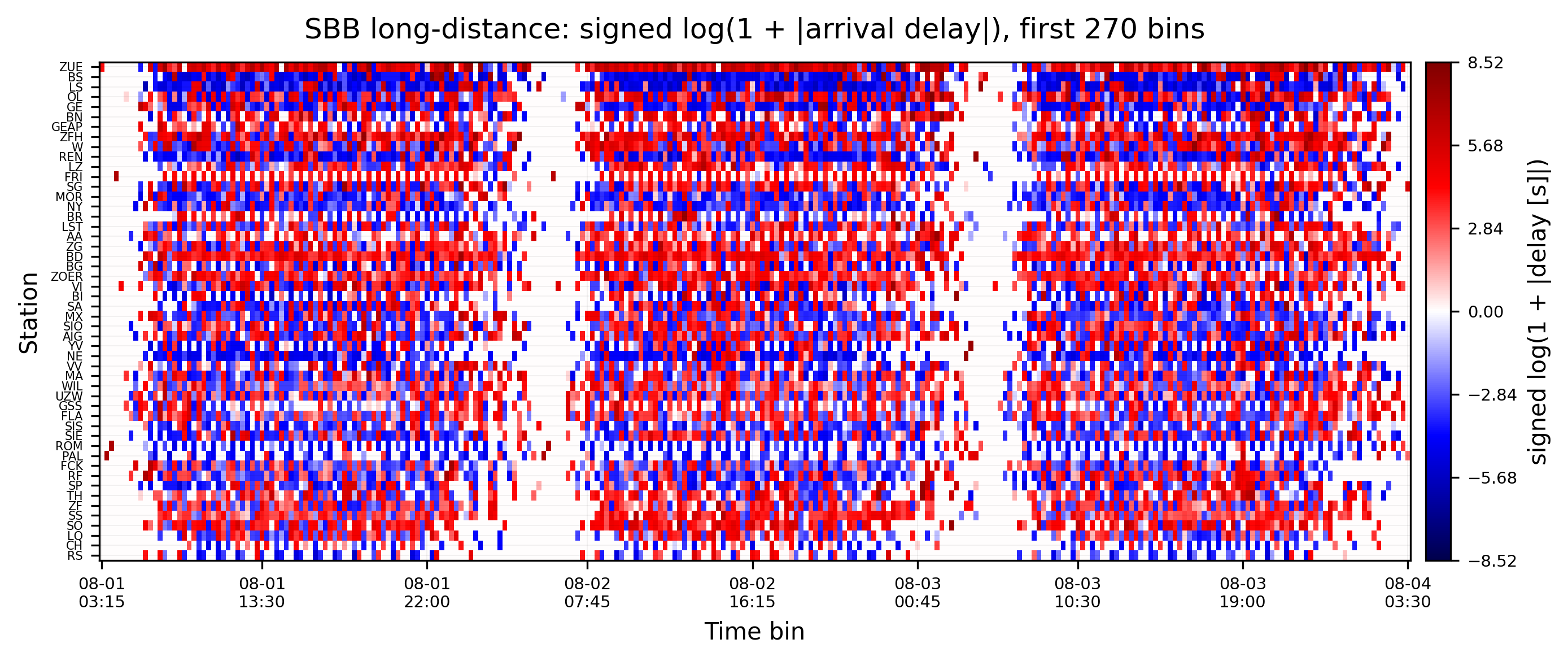
For these three days, you see that each station has their own arrival delay pattern that repeats daily. At the same time stations are not comparable in intensity and periodic pattern. While some stations regulariliy have positive arrival delay sums, others are negative, some alternating. To combat this and make them stationary, so connectivity measures can grasp them, detrending is essential. See the Detrending overview and the specific Z-Score detrending we will apply below.

Functional delay network#

1. Detrending#

The data has a daily and possibly weekly seasonality. We calculate the Z-Score with a 24h periodicity. With the 15 minutes data, this means a \(\frac{1\,\rm{day}}{15\,\rm{min}}=24\times 60\,\rm{min}/15\,\rm{min} = 96\) periodicity. For details and alternatives, see Detrending.

arrival_delay_15mins_matrix_detrended = dn.detrend(
    arrival_delay_15mins_matrix.to_numpy(), method="z-score", periodicity=96, axis=1
)
arrival_delay_15mins_matrix_detrended.shape
(50, 2709)

Hide code cell source

# Heatmap using detrended data
n_bins = 270

detrended_df = pd.DataFrame(
    arrival_delay_15mins_matrix_detrended,
    index=arrival_delay_15mins_matrix.index,
    columns=arrival_delay_15mins_matrix.columns,
)

data_det = detrended_df.to_numpy()[:, :n_bins]

# Apply signed log transform to z-scores for visual symmetry like the raw plot
# Use a small epsilon to avoid log(0); preserve sign
epsilon = 1e-6
data_det_log = np.sign(data_det) * np.log1p(np.abs(data_det) + epsilon)
abs_max_det = np.nanmax(np.abs(data_det_log))

fig, ax = plt.subplots(figsize=(10, 4), dpi=300)
im = ax.imshow(
    data_det_log,
    cmap="seismic",
    vmin=-abs_max_det,
    vmax=abs_max_det,
    aspect="auto",
    interpolation="nearest",
)

ax.set_title(
    f"SBB long-distance: detrended (z-score, period=96), signed log scale, first {n_bins} bins",
    pad=10,
)
ax.set_xlabel("Time bin")
ax.set_ylabel("Station")

station_labels = stops_long_distance_gdf["abbreviation"][
    : len(arrival_delay_15mins_matrix.index)
]
yticks = np.arange(len(station_labels))
ax.set_yticks(yticks)
ax.set_yticklabels([station_labels.iloc[i] for i in yticks], fontsize=5)

xticks = np.linspace(0, n_bins - 1, 9).astype(int)
ax.set_xticks(xticks)
cols = arrival_delay_15mins_matrix.columns[:n_bins]
labels = pd.to_datetime(cols).strftime("%m-%d\n%H:%M")
ax.set_xticklabels(labels[xticks], fontsize=7)

cbar = plt.colorbar(im, ax=ax, pad=0.01)
cbar.set_label("signed log(1 + |z-score|)", rotation=90)
ticks = np.linspace(-abs_max_det, abs_max_det, 7)
cbar.set_ticks(ticks)
cbar.ax.tick_params(labelsize=7)

ax.grid(which="both", color="k", alpha=0.06, linewidth=0.4)
ax.set_axisbelow(True)

plt.tight_layout()
plt.show()
../../_images/61f0f59ee5f8b712d6ab1f782ffaca66dfcdb9b4c417aae5447aa1ff2a886b25.png

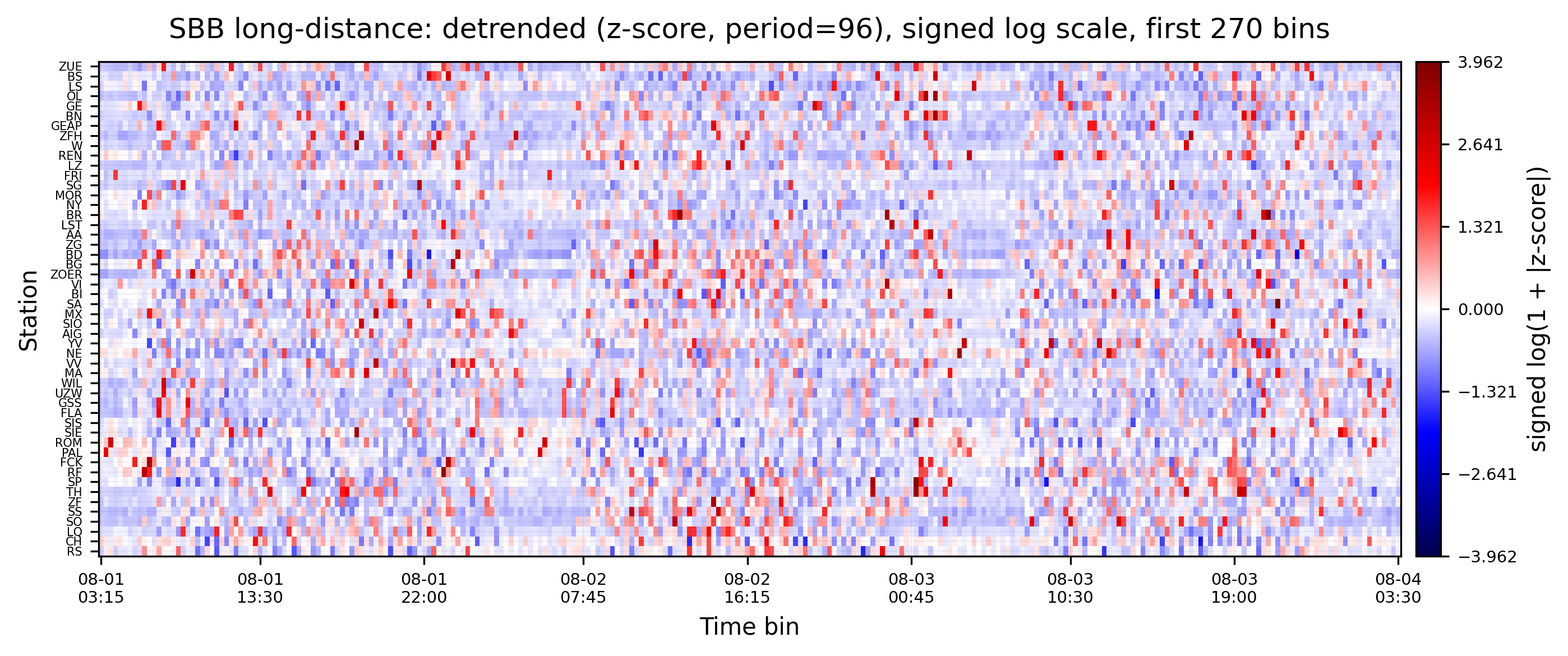
You can clearly see that the data is detrended and stationary when compared to the plot before. Now, each station’s signal is centered around zero, and the variance is reduced. Patterns with periodicity of 24h are also reduced.

2. Functional Delay Network Reconstruction#

weights, lags = dn.reconstruct_network(
    arrival_delay_15mins_matrix_detrended.T,
    connectivity_measure="gc",  # Granger Causality
    lag_steps=16,  # 4h max delay tested
#    workers=10,
)
Sequential: [##############################] 2450/2450 (100.0%) Time: 1.6m

We reconstruct a directed functional delay network using Granger causality over up to 4 hours of lags.

Hide code cell source

fig, ax = plt.subplots(figsize=(8, 6), dpi=220)
im = ax.imshow(weights, cmap="viridis")
ax.set_title("Granger-causality $p$-value matrix and lags (August 2025)", pad=8)
ax.set_xlabel("Target station")
ax.set_ylabel("Source station")

# Station labels
abbr = list(stops_long_distance_gdf["abbreviation"][: weights.shape[0]])
name = list(stops_long_distance_gdf["designationofficial"][: weights.shape[0]])
ticks = np.arange(0, len(abbr))
ax.set_xticks(ticks)
ax.set_xticklabels([abbr[t] for t in ticks], rotation=90, fontsize=7)
ax.set_yticks(ticks)
ax.set_yticklabels([name[t] for t in ticks], fontsize=6)

# Lag numbers
for i in range(weights.shape[0]):
    for j in range(weights.shape[1]):
        ax.text(
            j,
            i,
            str(int(lags[i, j])),
            ha="center",
            va="center",
            color="white",
            fontsize=5,
            fontweight="bold",
        )

cbar = plt.colorbar(im, ax=ax, pad=0.01, fraction=0.046)
cbar.set_label("GC $p$-value", rotation=90)
ax.grid(which="both", color="k", alpha=0.05, linewidth=0.3)
ax.set_axisbelow(True)
plt.tight_layout()
plt.show()
../../_images/c6fe992a811f34ec098b29ea9ff82f70e6347a9ee64832eb87ddbb1c06dd28ea.png

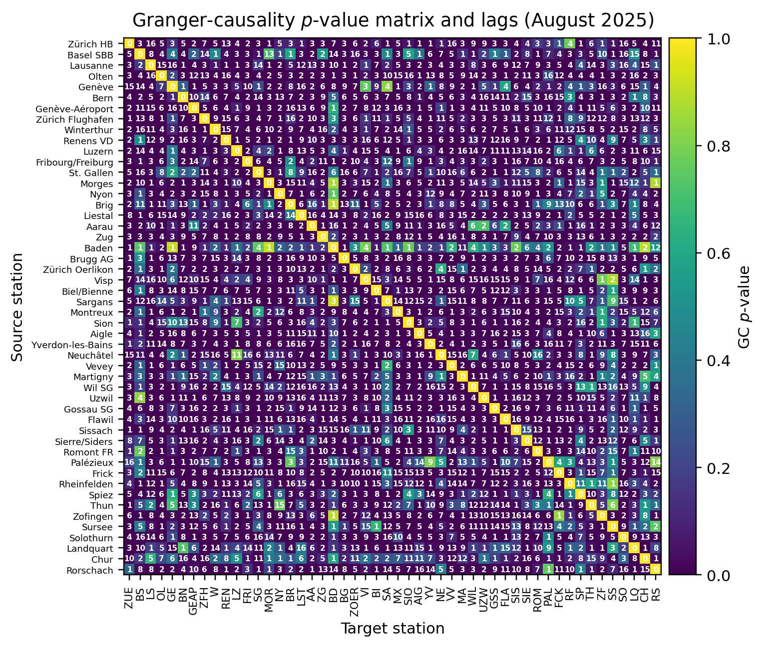
We now turn the dense \(p\)-value matrix into a sparse, directed adjacency by keeping only statistically significant links. We use α = 0.01 with Benjamini–Hochberg FDR control to account for multiple testing across all pairs. The result is a boolean mask where True = link kept. See Connectivity and Network Reconstruction for background on \(p\)-values, multiple testing, and pruning choices.

significant_connections = dn.network_analysis.statistical_pruning(
    weights, alpha=0.01, correction="fdr_bh"
)

Hide code cell source

fig, ax = plt.subplots(figsize=(8, 6), dpi=200)
ax.imshow(significant_connections, cmap="gray_r")
ax.set_title(
    "Pruned weight matrix for 15-min arrival delay for SBB long-distance trains in August 2025"
)
ax.set_xticks(ticks)
ax.set_xticklabels([abbr[t] for t in ticks], rotation=90, fontsize=7)
ax.set_yticks(ticks)
ax.set_yticklabels([name[t] for t in ticks], fontsize=7)
ax.grid(which="both", color="k", alpha=0.08, linewidth=1)
plt.show()
../../_images/5c10fdf995712af70718a047482edc62d17f5116f680fb0015ba1d0f59745359.png

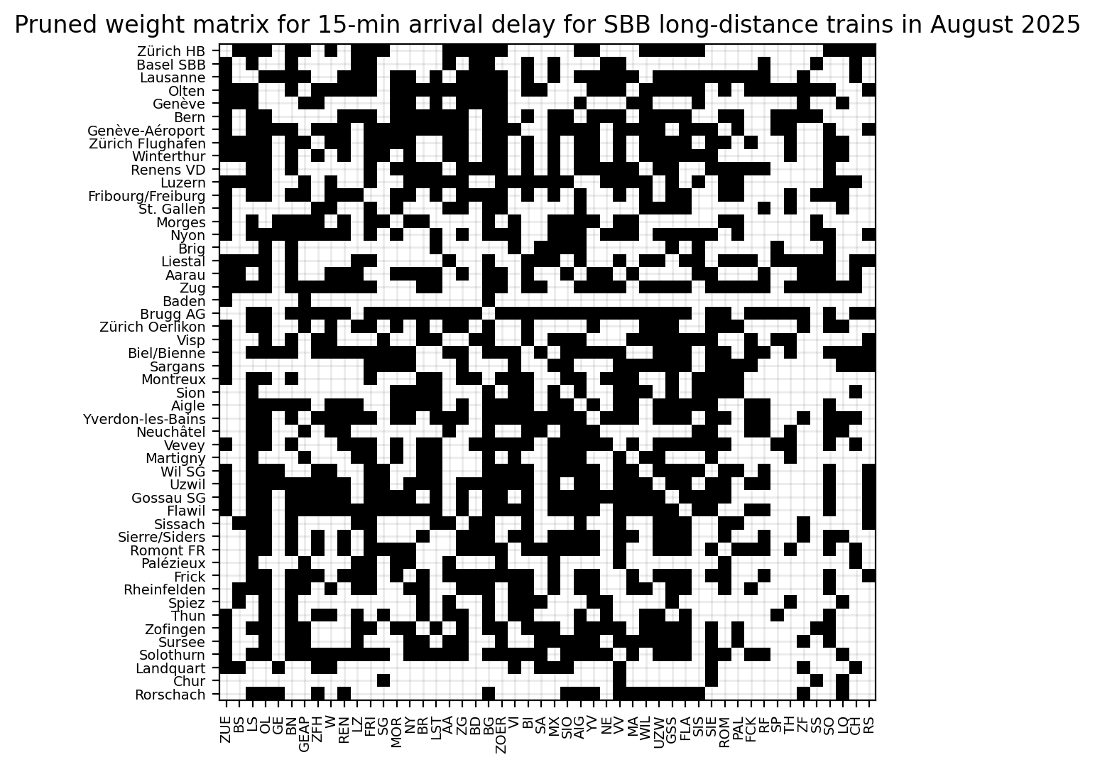
Reading the pruned matrix: black cells indicate kept (statistically significant) directed links i→j; white cells indicate pruned pairs. Rows are sources, columns are targets. Axis labels use station abbreviations (x) and official names (y) for orientation.

We convert the pruned adjacency into a directed NetworkX graph. Each row/column index corresponds to the station ordering used above; edges point from source (row) to target (column). This preserves the directionality of delay propagation. For geographic context, see the map view below.

G = nx.from_numpy_array(significant_connections, create_using=nx.DiGraph)

Hide code cell source

fig, ax = plt.subplots(figsize=(8, 6), dpi=200)
nx.draw(
    G,
    with_labels=True,
    node_size=300,
    ax=ax,
    labels=stops_long_distance_gdf["abbreviation"][:n],
    font_weight="bold",
    alpha=0.8,
    font_color="black",
    edge_color="C0",
    node_color="C1",
    connectionstyle="arc3,rad=0.1",
)
plt.show()
../../_images/ffda2fe2d292da29d87454c336de48678f8ed31805624afe1344f7655854b41e.png

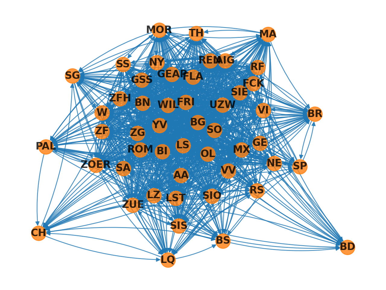
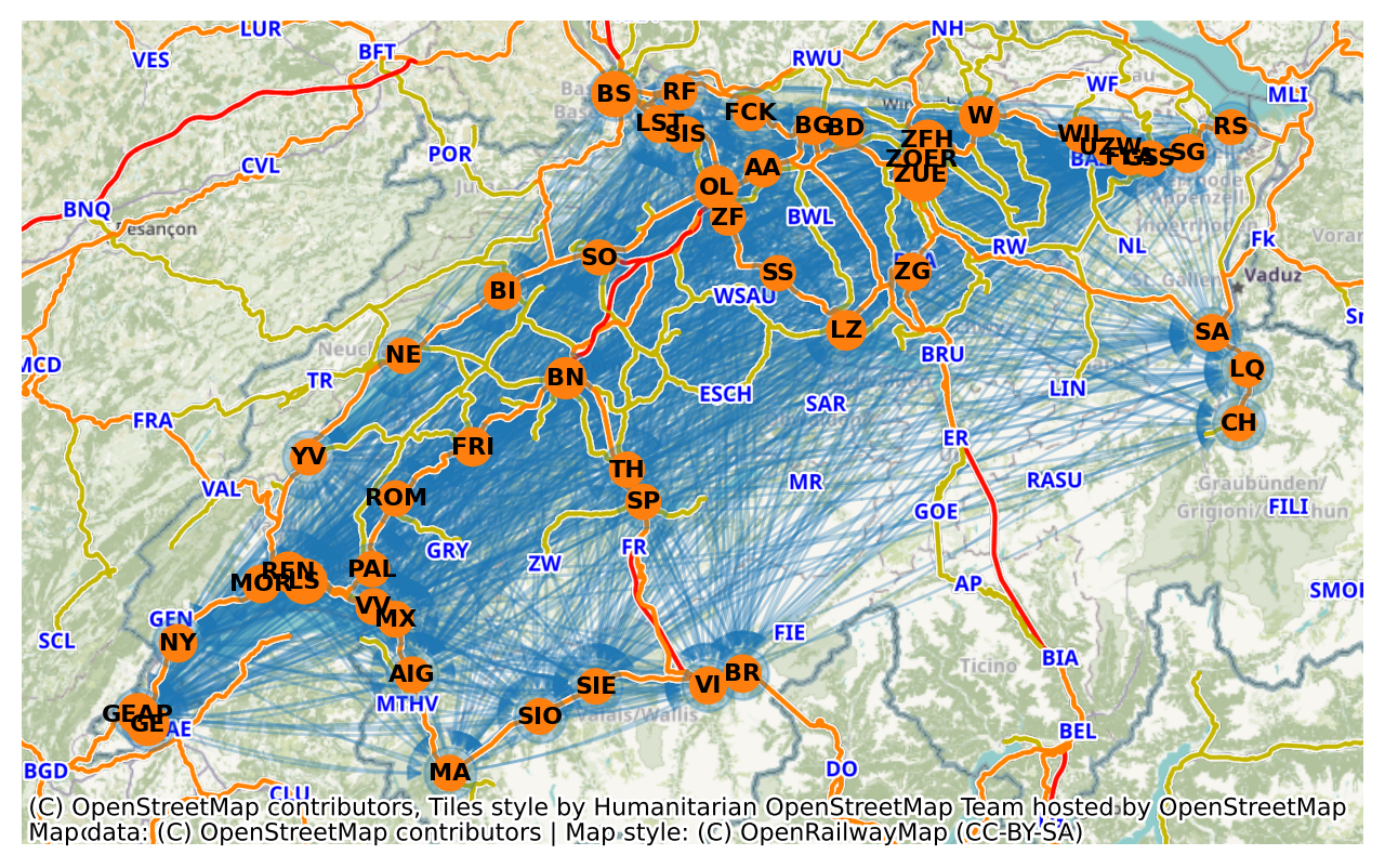
Now let’s plot this on the map. To place the abstract graph in geographic context, we place nodes at their station coordinates and overlay two basemaps (CartoDB and OpenRailwayMap).

node_sizes = (
    100
    + stops_long_distance_gdf["count"] / stops_long_distance_gdf["count"].max() * 200
)
n = 50

Hide code cell source

# Same plot, but geo-location from stops_long_distance_gdf.geometry
fig, ax = plt.subplots(figsize=(8, 6), dpi=200)
ax.set_aspect("equal")
stops_positions = {
    n: [point.x, point.y]
    for n, point in enumerate(stops_long_distance_gdf.to_crs(epsg=3857)["geometry"])
}
nx.draw(
    G,
    ax=ax,
    pos=stops_positions,
    font_color="black",
    edge_color="C0",
    connectionstyle="arc3,rad=0.1",
    alpha=0.3,
)
nx.draw_networkx_nodes(
    G,
    pos=stops_positions,
    node_size=node_sizes[:n],
    node_color="C1",
    ax=ax,
)
nx.draw_networkx_labels(
    G,
    pos=stops_positions,
    labels=stops_long_distance_gdf["abbreviation"][:n],
    font_size=8,
    font_weight="bold",
    ax=ax,
)
cx.add_basemap(ax)
cx.add_basemap(ax, source=cx.providers.OpenRailwayMap, zorder=1)
plt.show()
../../_images/d9a8f01713f584d93f8705c27ca96b883d0b1b5069810dbbc53afe76686ebb2e.png

3. Functional Delay Network Analysis#

Now infomeasure includes a number of network analysis functions which can easily be called on the pruned network, like so:

# Convert boolean mask to binary adjacency matrix
binary_adjacency = significant_connections.astype(int)

# Calculate link density
density = dn.network_analysis.link_density(binary_adjacency)
print(f"Link density: {density:.4f}")

# Find isolated nodes
isolated_in = dn.network_analysis.isolated_nodes_inbound(binary_adjacency)
isolated_out = dn.network_analysis.isolated_nodes_outbound(binary_adjacency)

print(f"Nodes with no incoming connections: {isolated_in}")
print(f"Nodes with no outgoing connections: {isolated_out}")

# Calculate betweenness centrality
betweenness = dn.network_analysis.betweenness_centrality(
    binary_adjacency, normalise=True
)
print(f"Betweenness centrality: {betweenness}")

# Calculate eigenvector centrality
eigenvector = dn.network_analysis.eigenvector_centrality(
    binary_adjacency, normalise=True
)
print(f"Eigenvector centrality: {eigenvector}")

# Calculate global efficiency
efficiency = dn.network_analysis.global_efficiency(binary_adjacency, normalise=True)
print(f"Global efficiency: {efficiency:.4f}")

# Calculate transitivity
trans = dn.network_analysis.transitivity(binary_adjacency, normalise=True)
print(f"Transitivity: {trans:.4f}")

# Calculate reciprocity (only for directed networks)
recip = dn.network_analysis.reciprocity(binary_adjacency, normalise=True)
print(f"Reciprocity: {recip:.4f}")
Link density: 0.5143
Nodes with no incoming connections: 0
Nodes with no outgoing connections: 0
Betweenness centrality: [ 3.18883728 -4.94291384  3.6862082   9.12121788 -3.64456172  2.84948463
  3.61455764 -0.1327453  -1.39159743 -2.94629722  0.29048022  1.27308985
 -2.46824501 -0.65476335  0.19678942 -3.49555222  2.25815556  0.51800054
  2.82700469 -4.71042075 13.60485487 -1.52527521  0.10947252  4.98021065
 -2.75750965 -0.46103533 -1.64934587  2.55494635  1.14541104 -3.00548935
  7.49215706 -3.11309281  0.05501394  1.34195019  2.21974008  0.72419998
 -1.74627825  1.24887435  0.18791854 -3.57226878 -3.06466005 -2.85093597
 -4.33894866 -2.7434172  -2.04131327 -1.57614079  0.72949755 -0.81324334
 -4.24756831 -2.33767465]
Eigenvector centrality: [ 0.93210474 -4.93601417  3.17023149  3.2356579  -5.11804375  2.61116891
 -0.35700017 -1.09730729 -0.83985993  0.4204134  -0.85988043  3.10782775
 -3.37357986  0.32508922  0.45722487  0.16034351  0.51559885 -2.09989085
  2.50992298 -3.13905511  4.28009036  1.50462083 -1.05109426  2.53497245
 -3.60266514  1.13251607  0.04550356  2.60415363  1.15945607 -1.80847609
  3.15115412 -0.82143743 -0.53319375  2.18267649  2.59669412  1.18635315
 -2.02632476  1.27530116  0.61614841 -2.82911415 -1.64697861 -1.88761402
 -5.34713255 -2.57310339 -3.64543826 -5.84920891  1.53720435 -2.9950427
 -2.50410155 -3.50723491]
Global efficiency: -919101964768.5000
Transitivity: -2.2526
Reciprocity: 9.9891

Some of these metrics are discussed within the Network reconstruction guide (see the analysis and examples at the end of that page); for context on pruning and interpretation within the pipeline, see also Connectivity.

Before plotting centralities on the map, we encode two ideas: node size \(\propto\) betweenness (bottleneck potential) and node colour \(\propto\) eigenvector centrality (being connected to other central nodes). Arrows remain directed; together these cues help spot hubs, bridges and periphery. Basemap layers provide geographic context (roads/rails) but the topology is purely functional.

Hide code cell source

# Centrality-based map plot with basemaps (last cell)
cmap_evc = "YlOrRd"
# Compute visual encodings from centralities
node_sizes = (
        300
        + (np.array(betweenness) / (
    np.max(betweenness) if np.max(betweenness) > 0 else 1))
        * 150
)
node_colors = np.array(eigenvector)

# Positions from GeoDataFrame in Web Mercator
pos = {
    i: (pt.x, pt.y) for i, pt in enumerate(stops_long_distance_gdf["geometry"][: n + 1])
}

fig, ax = plt.subplots(figsize=(12, 6), dpi=300)
ax.set_aspect("equal")

# Draw edges first
nx.draw_networkx_edges(
    G, pos, width=1.2, alpha=0.2, arrows=True, arrowsize=12, arrowstyle="-|>", ax=ax
)
# Draw nodes with eigenvector colour
comm_nodes = nx.draw_networkx_nodes(
    G,
    pos,
    node_size=node_sizes,
    node_color=node_colors,
    cmap=cmap_evc,
    alpha=0.9,
    ax=ax,
)
# Draw labels
label_map = {
    i: lab for i, lab in enumerate(stops_long_distance_gdf["abbreviation"][:n])
}
nx.draw_networkx_labels(
    G, pos, labels=label_map, font_size=7, font_weight="bold", ax=ax
)

# Basemaps
cx.add_basemap(
    ax, source=cx.providers.CartoDB.PositronNoLabels, attribution="", crs="EPSG:2056"
)
cx.add_basemap(
    ax,
    source="https://{s}.tiles.openrailwaymap.org/maxspeed/{z}/{x}/{y}.png",
    zoom=9,
    zorder=1,
    attribution="",
    crs="EPSG:2056",
)
cx.add_attribution(
    ax,
    text="Map data: © OpenStreetMap contributors © CARTO | Map style: © OpenRailwayMap (CC-BY-SA)",
)

ax.set_title(
    "Pruned Functional Network on Basemap (size=betweenness, color=eigenvector)"
)
plt.tight_layout()

# Colorbar for eigenvector centrality
sm = plt.cm.ScalarMappable(cmap=cmap_evc)
sm.set_array(node_colors)
cbar = plt.colorbar(
    sm,
    ax=ax,
    label="Eigenvector Centrality",
    shrink=0.8,
    pad=0.01,
    orientation="horizontal",
)
cbar.ax.set_position([0.59, 0.3, 0.2, 0.02])  # [x, y, width, height]

# Add opaque background rectangle around colorbar
cbar_bbox = cbar.ax.get_position()
# Add padding around the colorbar
padding = 0.015
bg_rect = plt.Rectangle(
    (cbar_bbox.x0 - padding, cbar_bbox.y0 - padding - 0.07),
    cbar_bbox.width + 2 * padding,
    cbar_bbox.height + 0.07 + 2 * padding,
    facecolor="white",
    edgecolor="grey",
    linewidth=1,
    alpha=0.9,
    transform=fig.transFigure,
    zorder=1,
)
cbar.ax.zorder = 2
fig.patches.append(bg_rect)

plt.show()
../../_images/8bab6ff9751f069f98c59f2b9321c2ff49e7990cd60bbb5c4b8baa80db3526ef.png

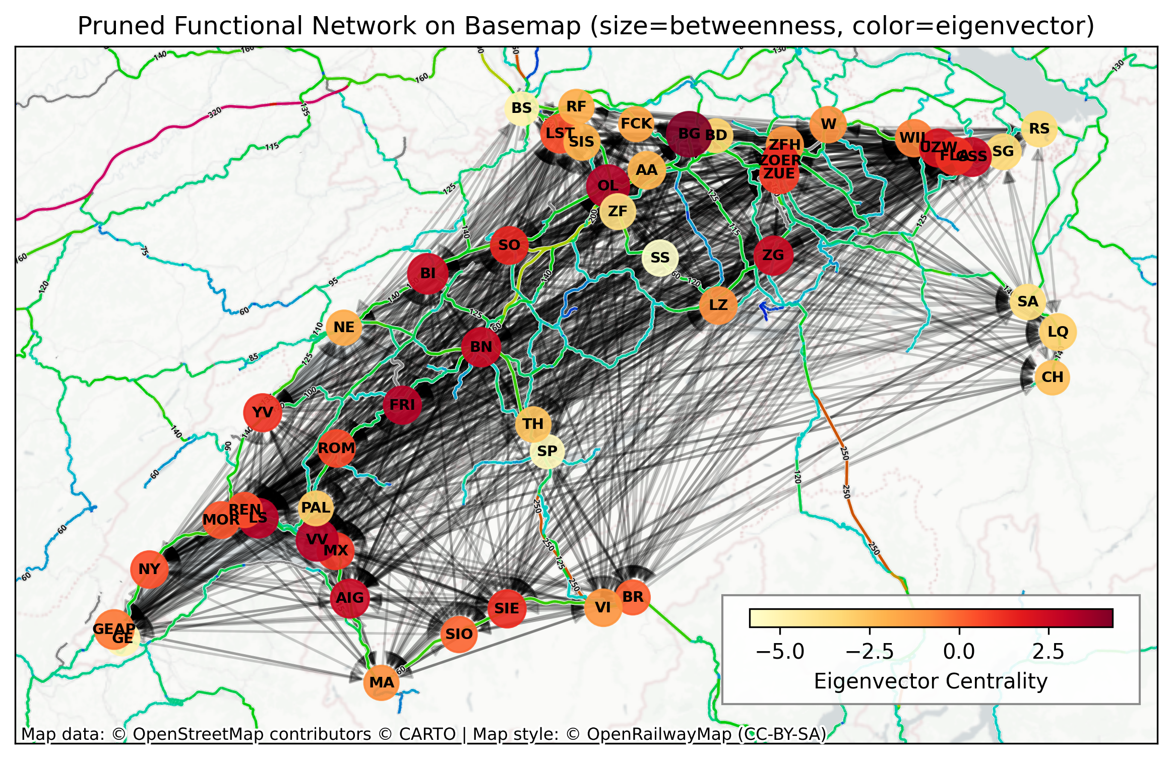
Interpreting sizes and colours: larger nodes often act as mediators of many shortest paths (high betweenness), while dark red colours (higher eigenvector) indicate influence via other influential neighbours. Comparing visually with the earlier binary map—centrality encodings can reveal role asymmetries not obvious from link density alone.

Hide code cell source

# Stations with the highest betweenness centrality
# take stops_long_distance_gdf["designationofficial"] and sort them by betweenness centrality
station_betweenness = list(
    zip(stops_long_distance_gdf["designationofficial"][:n], betweenness)
)
station_betweenness_sorted = sorted(
    station_betweenness, key=lambda x: x[1], reverse=True
)

print("Stations with the highest betweenness centrality:")
for i, (station, centrality) in enumerate(station_betweenness_sorted[:10]):
    print(f"{i + 1:2d}. {station:<30} {centrality:8.3f}")

station_eigenvector = list(
    zip(stops_long_distance_gdf["designationofficial"][:n], eigenvector)
)
station_eigenvector_sorted = sorted(
    station_eigenvector, key=lambda x: x[1], reverse=True
)

print("Stations with the highest eigenvector centrality:")
for i, (station, centrality) in enumerate(station_eigenvector_sorted[:10]):
    print(f"{i + 1:2d}. {station:<30} {centrality:8.3f}")
Stations with the highest betweenness centrality:
 1. Brugg AG                         13.605
 2. Olten                             9.121
 3. Vevey                             7.492
 4. Biel/Bienne                       4.980
 5. Lausanne                          3.686
 6. Genève-Aéroport                   3.615
 7. Zürich HB                         3.189
 8. Bern                              2.849
 9. Zug                               2.827
10. Aigle                             2.555
Stations with the highest eigenvector centrality:
 1. Brugg AG                          4.280
 2. Olten                             3.236
 3. Lausanne                          3.170
 4. Vevey                             3.151
 5. Fribourg/Freiburg                 3.108
 6. Bern                              2.611
 7. Aigle                             2.604
 8. Gossau SG                         2.597
 9. Biel/Bienne                       2.535
10. Zug                               2.510

Community Detection#

We also inspect meso-scale structure via Louvain communities. Here we convert the directed graph to undirected just for community detection and weight undirected edges by 1 (unidirectional) or 2 ( bidirectional) occurrences. Community colours nodes while sizes remain tied to betweenness for continuity with the previous plot. Use this to spot regional clusters or tightly interacting station groups.

Hide code cell source

# Louvain Communities
# Use same basemap and sizing as the centrality plot; color nodes by community; save as PDF
G_u = G.to_undirected()

# Set weights based on edge count in directed graph
for edge in G_u.edges():
    node1, node2 = edge
    # Count edges in both directions in the directed graph
    count = 0
    if G.has_edge(node1, node2):
        count += 1
    if G.has_edge(node2, node1):
        count += 1
    # Set weight to the count (1 for unidirectional, 2 for bidirectional)
    G_u[node1][node2]["weight"] = count

partition = nx.algorithms.community.louvain.louvain_communities(
    G_u, seed=82156, weight="weight", resolution=1
)  # Communities vary with seed - seed fixed for reproducibility
comms = list(partition)

# Map node -> community id
node_to_comm = {}
for cid, comm in enumerate(comms):
    for node in comm:
        node_to_comm[node] = cid
comm_ids = np.array([node_to_comm.get(i, -1) for i in range(len(G))])

# Positions and sizing same as previous centrality plot
comm_nodes = {
    i: {
        "pos": (row.geometry.x, row.geometry.y),
        "abbr": row.abbreviation,
        "designationofficial": row.designationofficial,
    }
    for i, row in stops_long_distance_gdf.iterrows()
}
pos = {i: val["pos"] for i, val in comm_nodes.items()}

# Keep node sizes based on betweenness for visual consistency
node_sizes_louv = (
        250
        + (np.array(betweenness) / (
    np.max(betweenness) if np.max(betweenness) > 0 else 1))
        * 200
)

# Use a discrete qualitative colormap sized to the number of communities
tab20 = plt.get_cmap("tab20")
# Reorder
color_order = [6, 0, 7, 1, 4, 8, 2, 3, 5, 9, 10, 11, 12, 13, 14, 15, 16, 17, 18, 19]
custom_colors = [tab20(color_order[i % 20]) for i in range(max(1, len(comms)))]
cmap_comm = ListedColormap(custom_colors)
# cmap_comm = plt.get_cmap("tab20", max(1, len(comms)))

fig, ax = plt.subplots(figsize=(10, 5), dpi=300)
ax.set_aspect("equal")

# Edges
nx.draw_networkx_edges(
    G, pos, width=1.2, alpha=0.2, arrows=True, arrowsize=12, arrowstyle="-|>", ax=ax
)
# Nodes coloured by community
nx.draw_networkx_nodes(
    G,
    pos,
    node_size=node_sizes_louv,
    node_color=comm_ids,
    cmap=cmap_comm,
    vmin=0,
    vmax=(len(comms) - 1 if len(comms) > 0 else 0),
    alpha=0.95,
    ax=ax,
)
# Labels
label_map = {
    i: lab for i, lab in enumerate(stops_long_distance_gdf["abbreviation"][:n])
}
nx.draw_networkx_labels(
    G, pos, labels=label_map, font_size=7, font_weight="bold", ax=ax
)

# Same basemaps as centrality plot
cx.add_basemap(
    ax, source=cx.providers.CartoDB.PositronNoLabels, attribution="", crs="EPSG:2056"
)  # LV95
cx.add_basemap(
    ax,
    source="https://{s}.tiles.openrailwaymap.org/maxspeed/{z}/{x}/{y}.png",
    zoom=9,
    zorder=1,
    attribution="",
    crs="EPSG:2056",
)
cx.add_attribution(
    ax,
    text="Map data: © OpenStreetMap contributors © CARTO | Map style: © OpenRailwayMap (CC-BY-SA)",
)

# Legend: show each community with its color and size
handles = []
for cid in range(len(comms)):
    color = cmap_comm(cid)
    size = len(comms[cid])
    handles.append(mpatches.Patch(color=color, label=f"Community {cid} (n={size})"))
if handles:
    ax.legend(
        handles=handles,
        title="Communities",
        loc="upper left",
        bbox_to_anchor=(0.71, 0.33),
    )

ax.set_title(
    "Pruned Functional Network on Basemap (size=betweenness, color=Louvain community)"
)
plt.tight_layout()
plt.show()
../../_images/620691f127c2eb7a5e694769b9141a25296e5374fdf30e530a10bbeaa57a22af.png

Hide code cell source

# Interactive functional network map with GeoPandas .explore()
# - Nodes: stations with hover tooltips (names, abbreviation, centralities, community)
# - Edges: directed connections with arrows; hover shows source, target, lag, weight
# Requires folium for rendering (installed by geopandas)
import folium
from shapely.geometry import Point, LineString
import matplotlib.colors as mcolors

# Ensure we have n stations and matching indices
n_nodes = len(G.nodes)
# Build node GeoDataFrame with attributes
nodes_df = pd.DataFrame(
    {
        "node_id": np.arange(n_nodes),
        "abbreviation": list(stops_long_distance_gdf["abbreviation"][:n_nodes]),
        "designationofficial": list(
            stops_long_distance_gdf["designationofficial"][:n_nodes]
        ),
        "betweenness": np.array(betweenness)[:n_nodes],
        "eigenvector": np.array(eigenvector)[:n_nodes],
        "community": np.array([node_to_comm.get(i, -1) for i in range(n_nodes)]),
    }
)
# Positions are in LV95/EPSG:2056 in 'pos' dict; convert to WGS84 for folium
nodes_geom = [Point(pos[i][0], pos[i][1]) for i in range(n_nodes)]
nodes_gdf = gpd.GeoDataFrame(
    nodes_df.copy(), geometry=nodes_geom, crs="EPSG:2056"
).to_crs(epsg=4326)
# Tooltip fields for nodes
node_tooltip = [
    "abbreviation",
    "designationofficial",
    "community",
    "betweenness",
    "eigenvector",
]

# Build edge GeoDataFrame (only significant/pruned edges)
edge_records = []
edge_geoms = []

# Reproject original CRS points to WGS84 for accurate lines
coords_wgs84 = {
    i: (nodes_gdf.geometry.iloc[i].x, nodes_gdf.geometry.iloc[i].y)
    for i in range(n_nodes)
}

for u, v in G.edges():
    if u < n_nodes and v < n_nodes:
        # Only keep edges that survived pruning if available
        if significant_connections[u, v]:
            x1, y1 = coords_wgs84[u]
            x2, y2 = coords_wgs84[v]
            edge_geoms.append(LineString([(x1, y1), (x2, y2)]))
            edge_records.append(
                {
                    "source": int(u),
                    "target": int(v),
                    "source_abbr": nodes_gdf["abbreviation"].iloc[u],
                    "target_abbr": nodes_gdf["abbreviation"].iloc[v],
                    "lag_steps": int(lags[u, v])
                    if isinstance(lags, np.ndarray)
                    else None,
                    "weight": float(weights[u, v])
                    if isinstance(weights, np.ndarray)
                    else 1.0,
                }
            )

edges_gdf = gpd.GeoDataFrame(edge_records, geometry=edge_geoms, crs="EPSG:4326")

# Use folium marker options via kwds
node_marker_kwds = {
    "radius": 7,
    "fill": True,
    "fillOpacity": 0.9,
}

# Draw edges first on a folium map, then nodes on top. Use style for arrows if supported by Leaflet PolylineDecorator via custom function.
# GeoDataFrame.explore returns a folium.Map; layer ordering is by call order
m = edges_gdf.explore(
    name="Edges (GC-pruned)",
    column="lag_steps",  # numeric field to color by
    cmap="viridis",  # any matplotlib colormap name or list of hexes
    legend=True,  # colorbar
    scheme=None,  # continuous
    style_kwds={"weight": 3, "opacity": 0.2},  # line width/opacity
    tooltip=["source_abbr", "target_abbr", "lag_steps", "weight"],
    tiles="CartoDB.Positron",
    zorder=0,
    show=True,
)

folium.TileLayer(
    tiles="https://{s}.tiles.openrailwaymap.org/standard/{z}/{x}/{y}.png",
    name="OpenRailwayMap (standard)",
    attr="© OpenRailwayMap (CC-BY-SA)",
    overlay=True,
    control=True,
    opacity=0.9,
).add_to(m)

comm_ids_sorted = sorted({cid for cid in nodes_gdf["community"] if cid >= 0})
colors_hex = [mcolors.to_hex(cmap_comm(i)) for i in comm_ids_sorted]

nodes_gdf.explore(
    m=m,
    name="Stations (nodes)",
    column="community",  # color by community
    categorical=True,
    categories=comm_ids_sorted,
    cmap=colors_hex,
    tooltip=node_tooltip,
    marker_type="circle_marker",
    marker_kwds=node_marker_kwds,
    zorder=3,
)

# Add layer control
folium.LayerControl(collapsed=False).add_to(m)

m
Make this Notebook Trusted to load map: File -> Trust Notebook

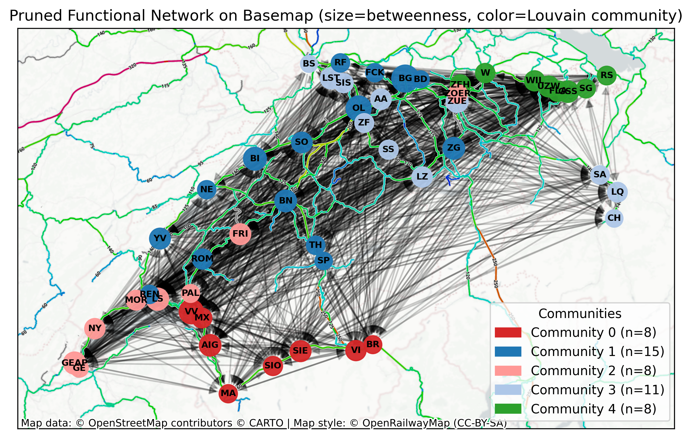
How to read the map layers: edge colours reflect the lag legend (when enabled) and only significant links are plotted. Remember \(p\)-values express statistical significance, not effect size; pairwise tests can miss indirect paths.

A brief summary: This demo shows an end-to-end workflow on real-world SBB long-distance data for a single month. We assemble station-wise delay time series, apply Z-Score detrending with daily periodicity, reconstruct a directed functional network via Granger Causality, statistically prune connections, and analyse structure with centralities and communities. For the conceptual background, more options, interpretation and multiple testing, see Detrending, Connectivity, and Network Reconstruction.